66% of marketers that spend at least 6 hours on social per week have seen more leads? No matter what you sell and who you sell it to, using social media as a marketing tool can help you grow your brand and pad your wallet. Quality social post design is key to double your results. And here we list design principles to enhance your social media posts.
1. Use your brand colors consistently
Colors are a powerful tool for social media because they offer a way to convey mood and meaning without words. When choosing the right color for your brand, consider:
- Is my brand masculine or feminine?
- What kind or feelings are associated with my brand?
- How do I want my customers/audience to feel?
The psychology of color and branding is a dedicated art, so ensure you choose brand colors that speak towards your personality and focus. Once you’ve created your brand color palette, which should consist of two to four colors, apply your colors consistently within your designs.
Your color palette applies to the colors you use in your social media graphics, as well as the imagery you choose.
2. Choose fonts that reflect your identity
Fonts bring your design’s message life. The fonts you choose should embody the personality and character of your brand.
Social media images are a great opportunity to branch out from your usual set of brand fonts. For example, a cursive or uppercase font wouldn’t be the best fit for longer sections of text on a webpage. Social media design is your chance to get creative with your font collection. Whatever fonts you choose, make sure you apply them consistently.
3. Good contrast
If you haven’t heard it by now, negative space (also referred to as white space) is great way to make your image stand out. Contrast attracts the eye and can be applied with font, colors, alignment, size and more.
How can you contrast an image? A simple way to implement contrast into your graphic design is through the use of colors.
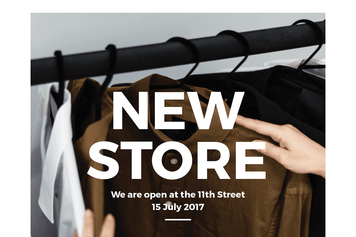
For example, to use a white logo with a contrasting dark color making the content both readable and visually appealing. The right balance can bring any social media graphic design content to life!
Text is also an important part of contrast. Choosing text sizes that contrast well, as mentioned above, will help to make your graphic pop. Creating a flowing design by surrounding words with white space will allow the elements to breathe. The use of space around text, shapes and other elements will make your design easier to read and also attract more attention than a cluttered design.
A good rule of thumb is if you have a light colored background then you should use a dark font (and vice versa).
4. Hierarchy
Help your audience to comprehend information quickly and precisely using visual hierarchy. According to Gestalt theory, humans tend to perceive an entirety of objects before they detect the individual objects.
Through structured visual characteristics (size, color, contrast, repetition, proximity, texture, alignment, etc.) designers are able to make users’ eyes follow certain a reading path and draw users’ attention to the most important elements.
5. Choose background images with clear copy space
Copy space refers to empty areas in images. Placing your text in areas with clear copy space will improve the legibility of your design, and help you get your message across.
If you need to create more copy space within an image, enlarge and crop it. This will give your text more room to breathe.
6. Use consistent layouts
You can create a series of posts using consistent layouts. These are a great way to engage your fans, as they look familiar every time your post them on your social media pages.
Make sure the layouts are designed with a common theme in mind. Nutella has demonstrated this approach on its Facebook page, creating a series of graphics with suggestions about how to eat Nutella. This is a clever, not to mention time effective, way to create unique visual content that builds your brand image and boosts user engagement.
7. Clarity
Whether your design is simple or complex, it should be clear, especially with regard to social media graphics. Don’t overdo the design and keep the balance between simplicity and informativeness. You don’t have much time to impress followers, so ensure your message is obvious.
Visual graphics are an integral part of any social media marketing plan and the designer’s contribution to the success of a marketing strategy is undeniable. As a designer, you should take into account marketing goals and your company’s tone when creating any visuals for social media. And don’t forget the main rule coupled with social media — never stop experimenting.
8.Optimize your image posts for different social media platforms
Maintaining your social media presence will have you posting on platforms such as Facebook, Twitter, Instagram and Google, which all have different preferred image dimensions.
Covering all bases on social media can be time consuming — the easiest way to optimise your graphics efficiently is to create templates for post types that you create regularly. For example, you could try these ideas:
- A weekly quote post
- An industry tip
- A cover image for a company blog
9. Prioritize Images over text
People respond well to images on social media because they’re easier to digest than text updates. Take advantage of your visual elements and only use text when necessary. Using icons is a creative way to minimize your text in your graphics.
In fact, if your images are strong enough, you might not even need any text or graphic overlays.
10. Know your platform
Repeat after me, each platform is different.
Knowing ahead of time what works best with each platform will not only help visually with your audience but will make things easier for you in the long run. Below are 5 social platforms and included some tips for each.
- Is geared toward the older generation
- Makes great use of articles and promotions
- Geared toward millennials
- Lifestyle shots are great as platform was built on “lunch and selfies”
- Great for engagement
- Great for celebrities
- Great for inspiration and new ideas
- Great for people looking for new products
- Great for business.
- Great for networking
Know what works best on each and know you’ll have to resize each piece of content to fit the dimensions of every platform you plan to share a social media graphic design with. It may seem tedious, but a quick size check could make the difference.